HEY YOU TAKE A NUMBER!:
An exploration into the shared hatred of the MBTA by a survey of Communication Design Students at Massart.
An exploration into the shared hatred of the MBTA by a survey of Communication Design Students at Massart.


So how did we get here?
In our MYE (Me, You, Everyone) project in Information Architecture my peers and I gathered a database of 400 different responses from our fellow massart students based on 21 questions we developed in class and then turned into a survey. Using the data collected the next task was to create a "Bird's Eye View" Poster.
WEEK 1:
Bird's Eye View
Bird's Eye View
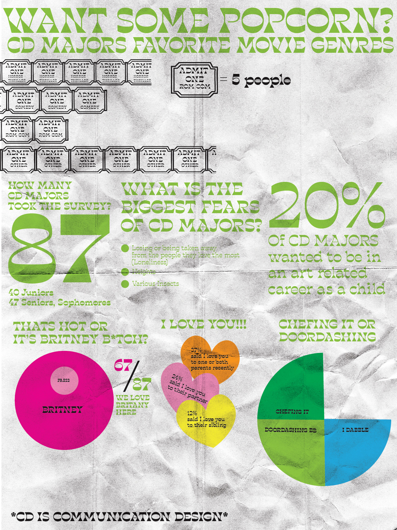
My biggest takeaways from this assignment were: reduced texture, more white space and a more legible type choice
WEEK 2:
Sequence
Sequence
In the sequence week my biggest takeaway was to include more a narrative rather then just the raw data.
WEEK 3:
Exhibition
Exhibition
Like any good college student, I got back from thanksgiving break and wanted to start going to gym when I returned. To my dismay the Greenline was completely shut down for maintenance the entire week I was back. I was walking back and forth for twenty minutes through rain and crowded sidewalks. To make it even worse I had a class that ran till 9:45pm which meant having to walk home, on my own at ten at night which as a female human is absolutely terrifying. So I definitely developed a hatred for it.
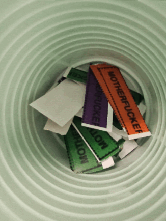
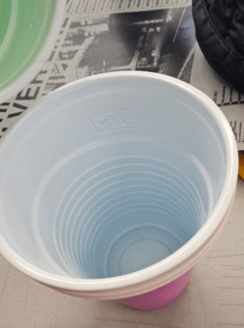
So like all great artists; I channeled that hatred into an interactive art piece and to my surprise my peers loved it. It was a huge departure from my normal work and I developed unknowingly what became my final project. I made four posters of the transportation lines I had used and assigned same color cups to each poster to collect the slips of the posters. To combat any issues with color blindness.thatIn the event where I was setting up this exhibition in public space everything would be adjusted to make it easy for anyone to participate.
So like all great artists; I channeled that hatred into an interactive art piece and to my surprise my peers loved it. It was a huge departure from my normal work and I developed unknowingly what became my final project. I made four posters of the transportation lines I had used and assigned same color cups to each poster to collect the slips of the posters. To combat any issues with color blindness.thatIn the event where I was setting up this exhibition in public space everything would be adjusted to make it easy for anyone to participate.
WARNING: SHAKING VIDEO AND JERKY MOVEMENTS

Gif showing the 3rd week of data collection
a cup spining with 3rd weeks data
visual display of w3's data
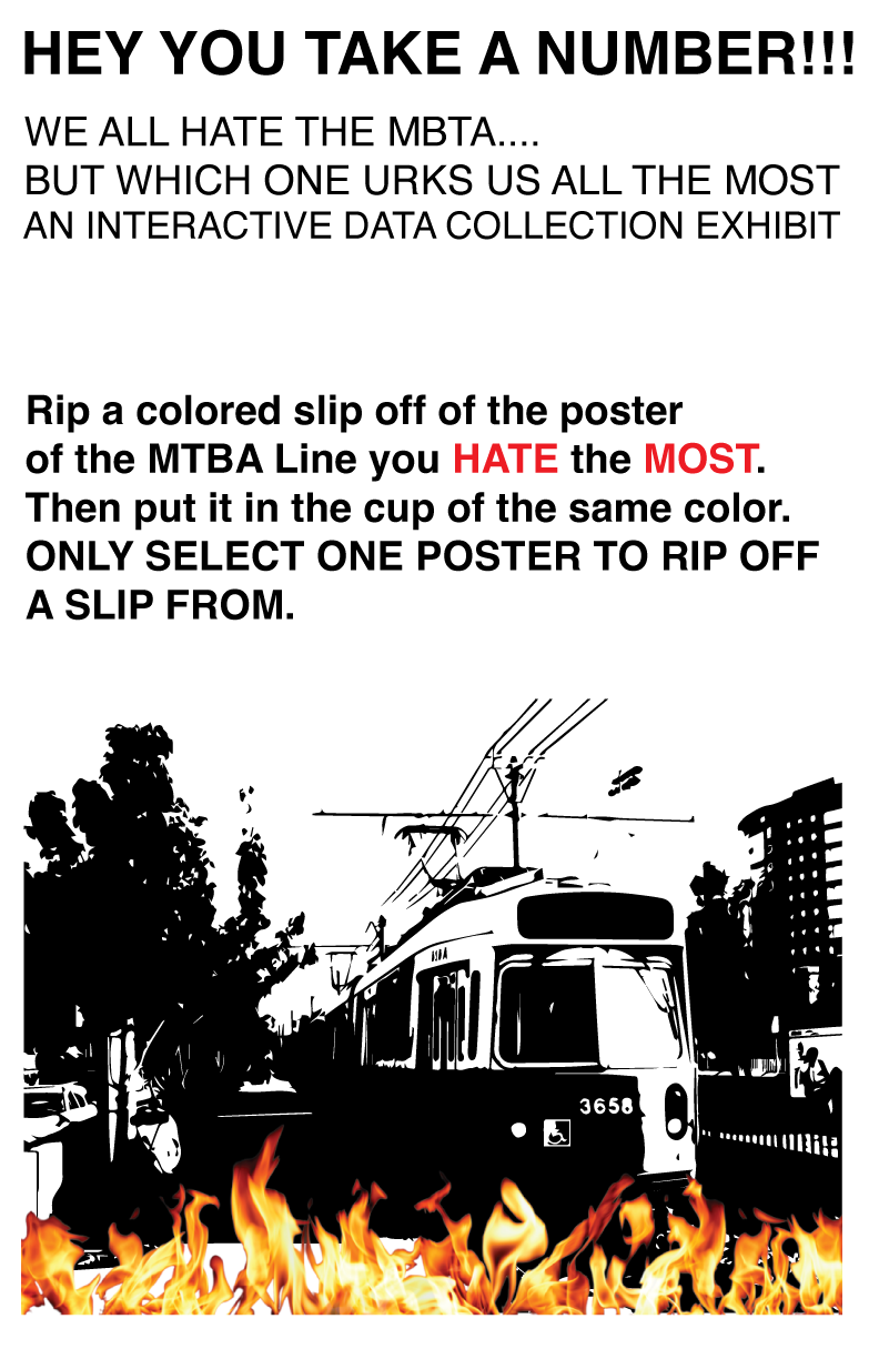
The instructions
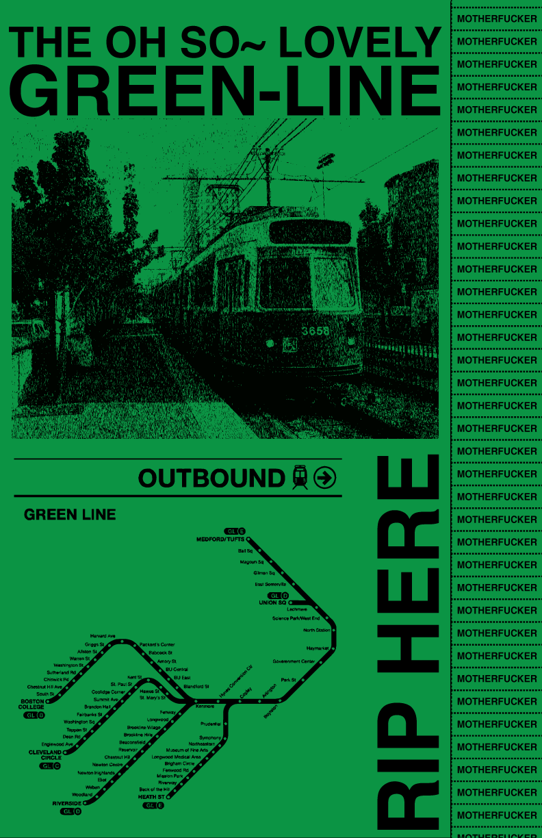
Green line Poster
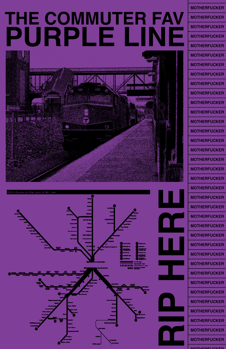
Purple line Poster

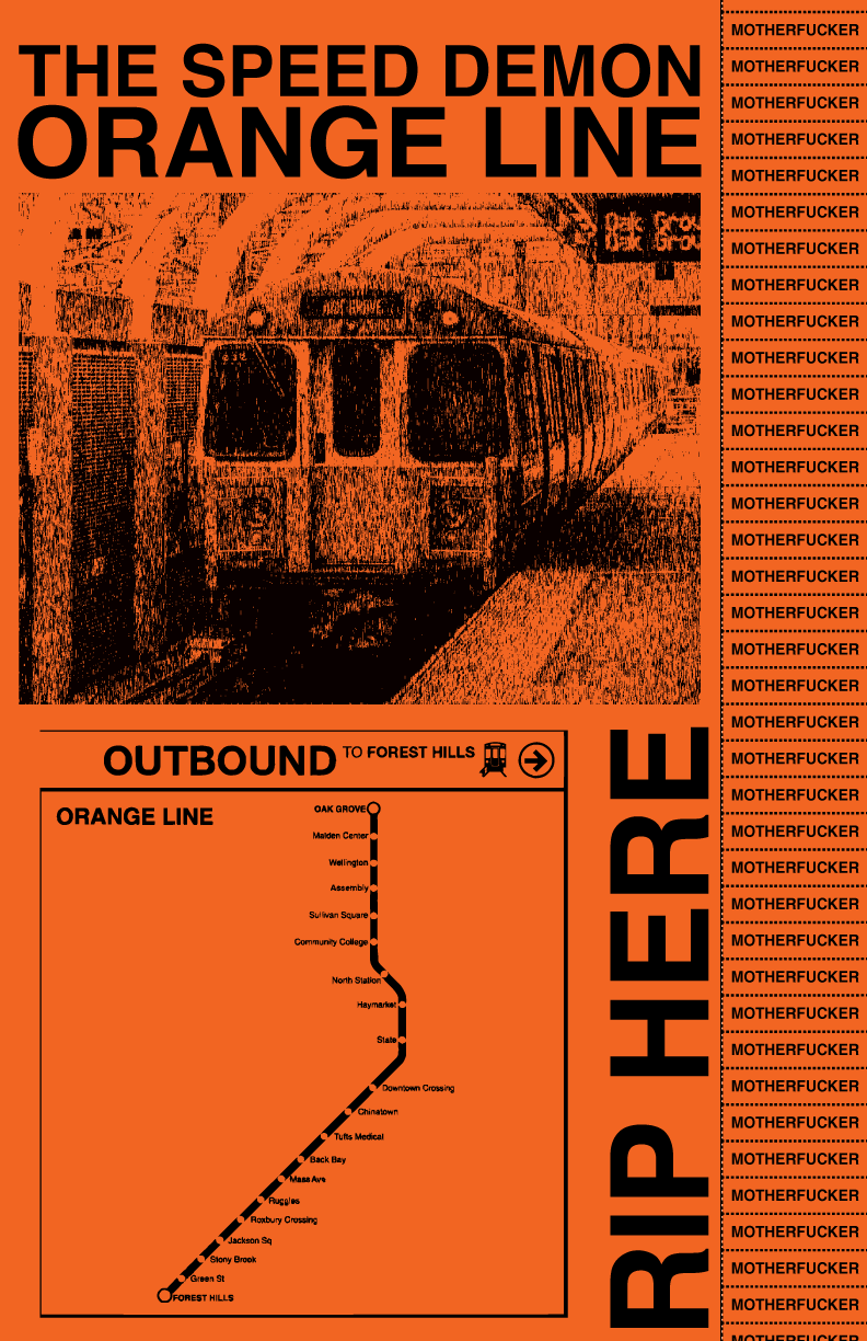
Orange Line Poster
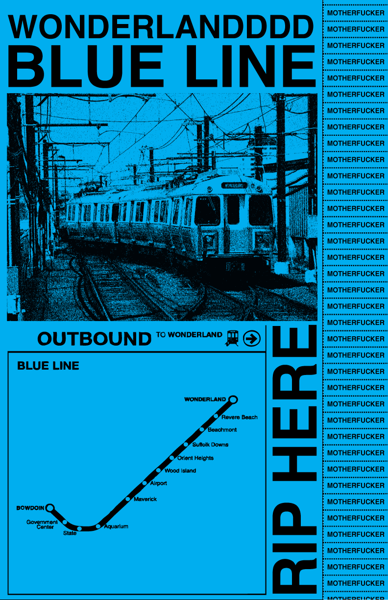
Blue Line Poster
WEEK 4:
Hey You Take A Number!
Hey You Take A Number!


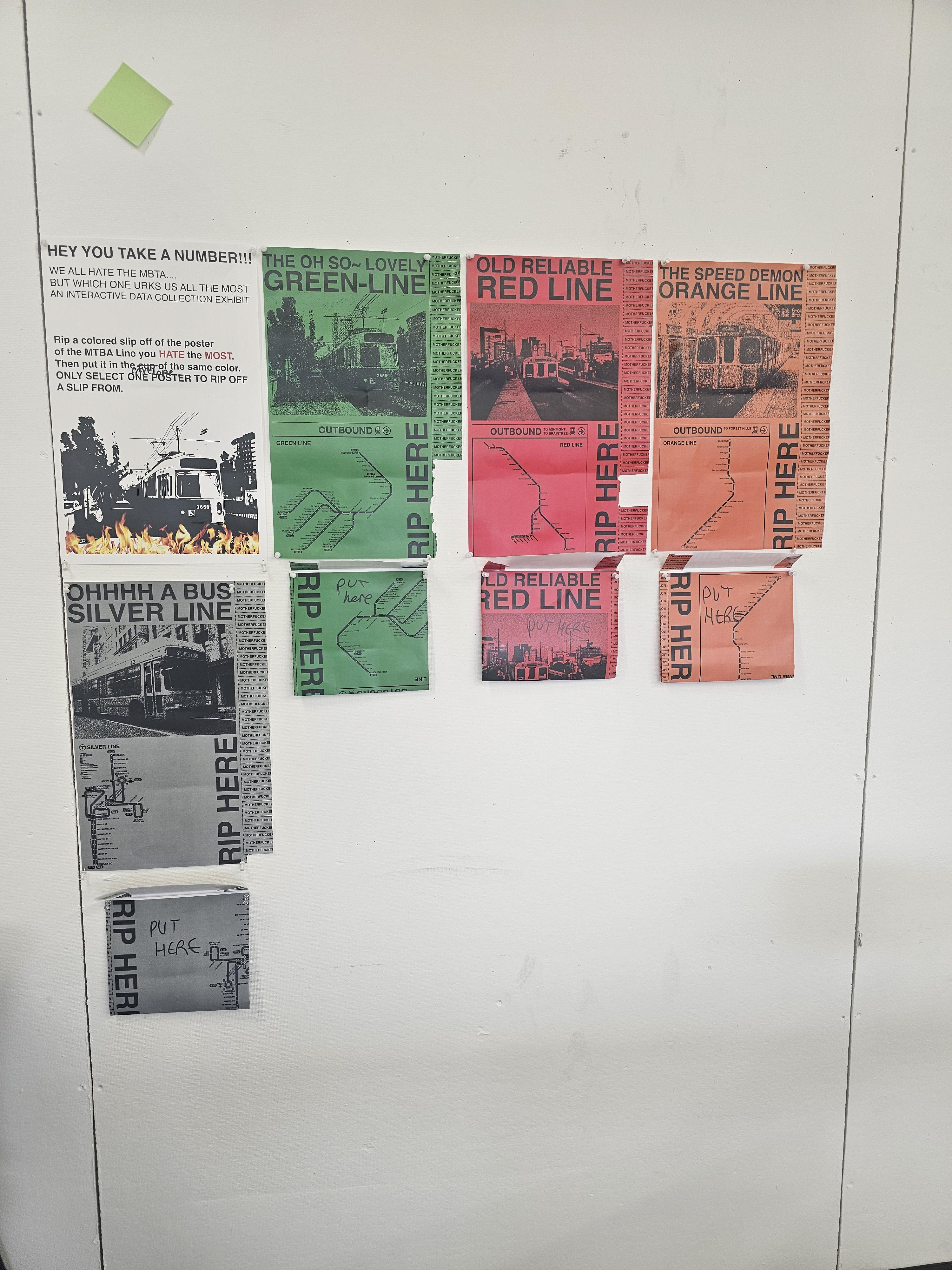
W4: Updated poster set and collection method

Flip-through gif of all my posters
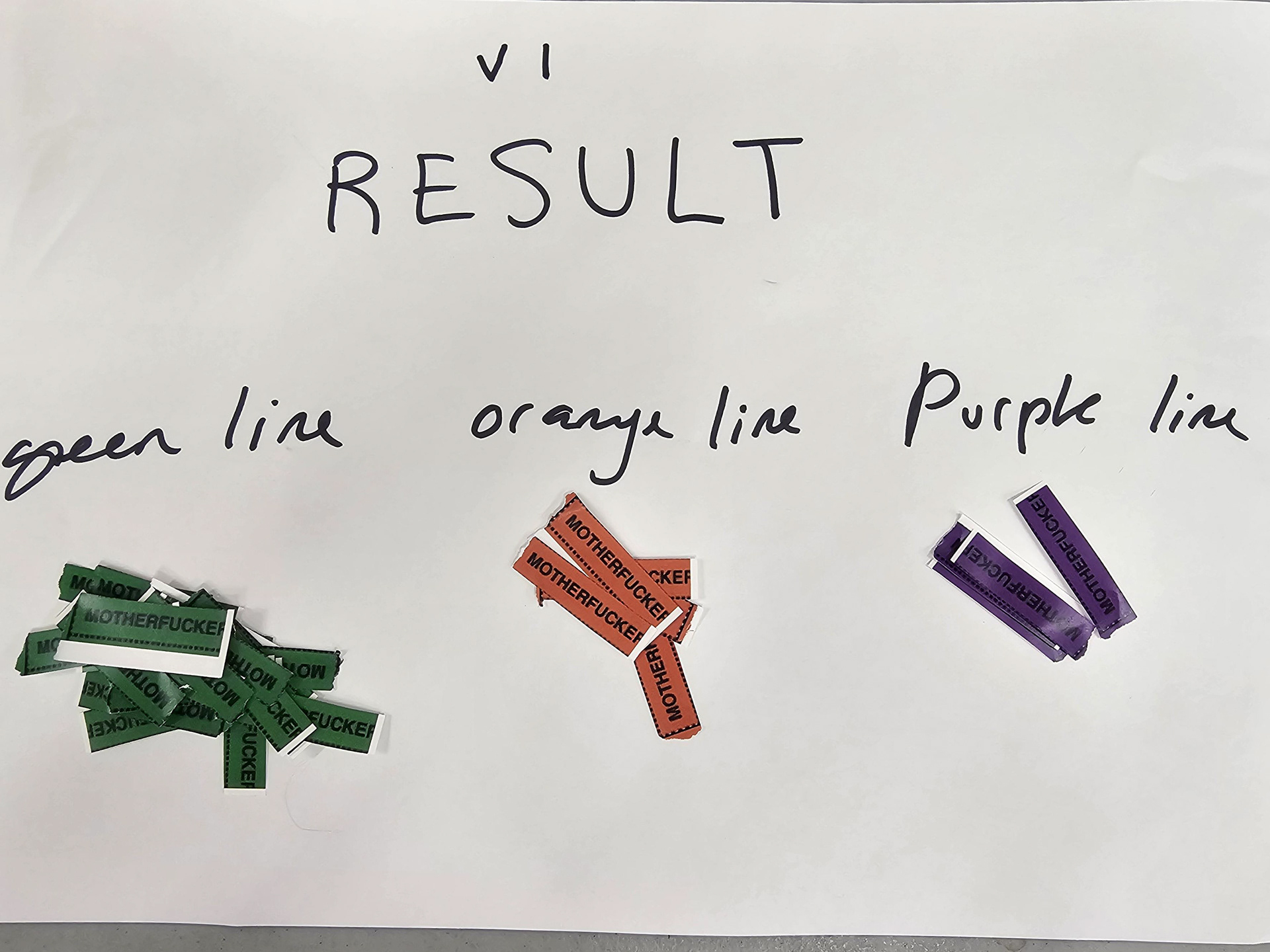
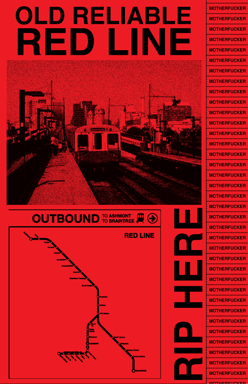
For this final I wanted to play with the themes of irony and satire so for all my posters they have a nickname that is completely sarcastic. To make this poster set as inconspicuous as possible I matched the MBTA brand kit with my content using helvetica and the different transportation routes to my advantage. For this specific data gathering portion I swapped out my control (Blue Line) and the purple line for the silver line and the red line. The result was the green line was the most hated even with two other variables swapped in. Although the lack of full participation led to problems with the data set the second time around. Unfortunately I forgot the colored cups at my apartment and as a replacement repurposed reject prints of the posters as collection envelopes. But everything worked out in the end.
The final data set is the following:
Orange line= 6
Green Line= 23
Red Line=2
Purple Line=4
Blue Line= 0
Silver Line= 2
Orange line= 6
Green Line= 23
Red Line=2
Purple Line=4
Blue Line= 0
Silver Line= 2
Documentation